Wednesday 18 May 2011

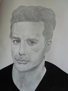
Also for this project as a collaboration experiment we attempted to set up our own drawing machine.  Tom was in charge of putting the equipment together which involved using a monitor and a large video camera. The camera pointed to the person we would be drawing and their image was transported to the monitor screen, we then placed a piece of acetate over the screen and drew round the image. It was a good experiment and we managed to draw most of the students in the studio. Once we had collected a fair few drawings we decided to paint some colour onto the back of them to see what different effects we could create. Below are some examples of the finished pictures

We overlapped several of the pictures and placed them on the window to give them a background, I think they looked quite effective.

Eve showed us some examples of an artist who arranged her images into the shape of letter or numbers, so we decided to try this with our own images.

The letter 'L'
Number 1
Number 2

Number 3


I found our collaboration both difficult and hard work. The difficult part was getting everybody to work together and produce work as a group. It was very hard getting everybody to stay focused on what we were actually doing and what we were trying to achieve from the collaboration. Although we all seemed to work independantly, we did eventually all aim for the same finaly. I was pleased with our finished publication it showed all our independant work coming together as a final piece and it actually worked. So in my opinion we were successsfull as a collaboration group.
Painted using watercolour paints
This picture was influenced by an artist called Alice Moloney, who is a new artist and is still currentley studying for her Masters in Communication Art and Design at the RSA in London. She takes everyday people and paints them in her own distinctive style using watercolour paint. I really like her how she blends the colours and kind of distorts the faces, but in a nice way. I have tried to copy her style with the picture above, but I also over exaggerated the distorted look a little.  Though I have to say,I did find it hard trying to replica her technique with watercolour paint. These are some examples of her work.

This was painted from a magazine photo of Nicole Kidman, which I messed around with on photoshop and managed to age her to fit in with our project. It was also painted in the Alice Moloney style.

Nicole Kidman (Aged)
Painted with watercolour paints

Tuesday 17 May 2011

SIR PATRICK MOORE

Drawn with graphite pencil and acrylic paint

Sir Patrick Moore our own famous astronomer and presenter of 'The Sky at Night', a job which put him proudly in the Guiness book of records as the longest serving presenter. He is greatly admired for his devotion to raising money for hundreds of charities, which he does from his own home in Selsey, by organising garden parties to raise money.
I am very lucky as a member of my family is actually friends with him and lives just round the corner from his house. I thought it would be fantastic if I could show Mr Moore my portrait of him and get him to sign it for me.  I asked sue (my relation) if she would mind taking it round to his house, she very kindly agreed and asked me to send the picture via e-mail to her, which I did. She dropped it round at his house and she received a phone call inviting her round to see him, as he really liked the picture and he wanted to discuss it with her. She went round the following day and he actually said that his advice to me would be to make myself a portfolio and take it to The Royal College of Art to begin with and any other major college as he thinks they would gladly accept me, with the talent I have. I was trully shocked and extremely flattered by his response, it was totally unexpected. I am hoping to hear from Sue in the next few days as she went to Mr Moores recent garden party on Sunday, where she was going to ask him to hold my signed picture and take a photograph, which she will then send to me.  So watch this space!!!
I wanted to draw Mr Moore because he is also a classic example of a man who has aged gracefully and even though he has been in the public eye for so many years, he has obviously not felt any pressure to roll back the years with the help of surgery and you have to admire him for that.

NELSON MANDELA

Painted with acrylic paints

Nelson Mandela is a classic example of a very distinguished older man who has definitely allowed the ageing process to take its natural toll. He is a man who stood up for his beliefs and is an inspiation through out the world to all who are opposed to oppression and deprivation.

MICKEY ROURKE

Drawn using graphite pencil and acrylic paint

Mickey Rourke is a great example of a celebrity who has clearly tried to shave back the years with the help of a scalpel. Unfortunitely like many other pressurized celebrities, striving for perfection he didn't know when to stop resulting in a classic case of extreme surgery gone wrong.

MICK JAGGER

 Drawn using graphite pencil 

I chose to draw Mick Jagger because he is famous for his rugged and rather lived in appearance, even in his youth.  It is evident that he has not resorted to surgical proceedures unlike most celebrities of his age. I thought he was a good example of someone who is comfortable in their own skin, thus allowing himself to grow old gracefully.


MICHAEL JACKSON

Michael Jackson was probably the most famous person on earth both for his music and also his surgical proceedures. He took surgery to the extreme, making himsef almost unrecognizable. He was the perfect celebrity to draw for this project as an example of bad surgery gone wrong. However, his perseverance to radically change his appearance was not just based around  preserving his youthful looks, I think it was more about making himself look like a different person altogether.

Monday 16 May 2011

MIKE TYSON

Mike Tyson is also a celebrity kown for his distinctive, less than pretty appearance. Which is why I chose to draw him.  He also has not undergone any surgery and seems to be following the natural ageing process.  For the image below I used photoshop to disfigure his face and make him look ugly. I over exaggerated his eye and cut out his ear, relating to the incident when he bit off someones ear in a boxing match.

Drawn using coloured charcoal and acrylic paint.
I used photoshop to disfigure Tysons facial features.

COLLABORATION

Our final project of the year was a collaboration project, we were split into groups of four, my group was a drawing group and my collaborotive colleagues were Tom, Amy and Zoe. The aim was to take our individual skills and put them together producing work as a team and then finally working towards a publication to show our work collaboratively.
My research into collaborations was based on the 'If You Could' exhibition, where 33 pairs of artists exhibited their work in their collaborative pairs. The exhibition was held at the A Foundation Gallery, Rochelle School in London. The work ranges from classic framed pieces to more ambitious experimental sculpture, film and installation.
I picked out a few of the artists whose work inspired me. Anthony Burrill and John Griffiths were a good combination as one was a designer and the other an astronomer, also Rob Ryan and Michael Marriott produced a very good collaboration as they are both excellent in their own fields.
Our work was to be based on imperfection, Amy concentrated on grotesque figures, Zoe drew celebrities badly purposely, Tom made a camera and took photos with it making them as imperfect as he could when devloping them and I concentrated on ageing celebrities and cosmetic surgery gone wrong. We set out to create our own portrait gallery with the intention of exhibiting our final work. I have posted some examples of my finished portraits, some of which were featured in our final magazine, titled 'The Drawing Opera'.
Anthony Jeffers and John Griffiths
[P170110_13.52.jpg]
Rob ryan and Michael Marriott

Wednesday 27 April 2011

This is Morogoro Town


Morogoro town lies at the base of the Uluguru Mountains in the southern highlands of Tanzania. The locals speak swahili which is lovely to listen to and quite easy to pick up and  greeting tanzanians in their own language means an awful lot to them despite how bad it may sound. They are very humble and accomodating people and always make you feel welcome. My daughter attended the In ternational school here for two weeks, as her school in England had different easter holidays to my son's school. So she flew out with my husband two weeks before us and she has spent a month here in Morogoro. It has been a wonderful experience for her and she has enjoyed every minute of her time here in Africa. The way of life here is very slow and there is very little to do. The house chores are taken care of as a house maid is employed, escari's are employed to watch the house night and day and garden staff look after the outside of the house, so basically you could become very lazy. We have had a very relaxing two weeks and we fly back to England on Saturday, but we will be back here in the summer.

Friday 22 April 2011

Karibu to Africa

Mickumi National Park (Tanzania)
This was how I spent my Easter Holiday, we came to Africa to stay with my husband who works in a place called Morogoro, which is in Tanzania. This is a far cry from a holiday resort, it is what I would describe as 'real Africa' being only a couple of miles from the bush.


We visited the Mikumi Natioal Park which is located in the north of the Selous Game Reserve in Morogoro. It is overlooked by the Uluguru Mountains in the north and Rubeho Mountains to the south east. The main feature of the park is Mkata River Flood Plain. Mikumi Park stretches over 3230 sq kilometers and is well known for its population of elephants, giraffes, buffaloes, zebra's, wildebeest and sable antelope. Its predators include tree climbing lions, leopards, wild hunting dogs and black-backed jackel and has more than 400 species of birds. The coolist thing is it is quite common to see giraffes, elephants, zebra,  lions and leopards walking along the road side and that's before you get into the actual park. We saw most animals other than the predators, it's great to see wild animals in their natural enviroment where they are free to roam with their families, I visited the Serengetti game park 12 years ago and I have never visited another zoo since, I find it cruel and uncomfotable to see these animals forced to live in such an unnatural enviroment not to mention the climate change which they have to adjust to.  We had a fantastic day in the park and the kids loved it.


Thursday 21 April 2011

Rob Ryan at The Yorkshire Sculpture Park


Rob Ryan is an artist who's work requires extreme accuracy, skill and precission.  He is famed for his detailed hand cutting of delicate papers into intricate patterns. I visited The Yorkshire Sculpture Park in November 2009 to see the Rob Ryan exhibition, where he had transformed the visitor center with his imaginative paper cuts and screen prints.  He had decorated the four meter shop window with a huge paper cut panel, which was quite impressive, when you appreciate how much work must have gone into something so extreme. The exhibition also consisted of several framed one off papercuts and limited edition screen prints. I trully aspire to Rob Ryan as an artist, he produces beautiful intricate pieces of art.
I made a book last year which was based on paper cutting in various styles, the theme for the book was my two children, so the project involved taking lots of photos of them both, then cutting stencils and sillouettes from the pictures. It was a project I throughly enjoyed doing, influenced  by the work of Rob Ryan.
This year we also had the chance to draw with a scalpel in our Drawing Enquiry project. Our subject was a skeleton, which without any under drawing we had to cut out of an A1 piece of paper, it was very challenging for me as I am used to drawing out in pencil first, however I proved to myself that any thing is possible it just means you have to concentrate a little bit harder.


Wednesday 20 April 2011

My reflection on David Hockney as an artist.

I find David Hockney to be very inspiring as an artist as his work is so diverse. I found his book 'Portraits and People' very useful both last year on my access course and this year on my degree course, as the theme for our collaborative project was based around portraits both of everyday people and celebrities. I have been researching artists like David hockney who has worked extensively in photography for years, to find out why he is so commited to painting portraits when he could just take a picture. Hockney say's 'he has fallen out of love with the medium, because of its digital manipulation' and now belives 'it is a dying art form'. He says' the impact of computerised images has made it so nothing is authentic anymore, making it hard to believe any image we see as being true to life.' Hockney hopes that when enough people realise that the camera does lie through various degrees of manipulation, this will prove to be a positive side effect for painting.
David Hockney produced a video about the use of optics in the works of old masters which he called 'Secret Knowledge'. It is his belief that optical aids were used by the early masters to create their portrait paintings. We used this information to create our own camera lucidas for our drawing enquiry project at the beginning of the year. This was something I really enjoyed doing, trying to draw an image with a camera lucida was something of a challenge, but I found that the more I did it the easier it became, also the line quality of a lucida drawing is very loose which I found to be good practice for myself as my drawings are usually very tight and precise. At the end of the day even if tools like this were being used by the early masters, they were very raw tools and the perfect portrait still relied on the skills of the artist.

Sunday 3 April 2011

David Hockney at the York Museum


Bigger Trees Near Warter

Whilst on my tours of local exhibitions, I read about David Hockneys largest ever picture to date being exhibited at the York Museum, I am a big fan of Hockneys work so I was quite excited to be able to go and see it. I was blown away by the vast size of it, as it stretched across one full wall of the gallery space, measuring 15ft x 40ft, comprising of a total of 50 canvases placed together in rows of 5 x 10. The painting was on loan from the Tate Gallery in London and this was its first actual viewing outside of London. I found myself just staring at the painting in ore, woundering how he managed to make it all come together so successfully as he would have had to paint each canvas individually. It was an exhibition well worth seeing and both my daughter and myself both throughly enjoyed the day. 
These are a few of my drawings of Zara Woods work, which I have used as an influence in my drawing practice book, which is an on going module we have on a Friday.

Wednesday 30 March 2011

Little Love Owls

Zara Wood at The Yorkshire Sculpture Park

                                                 The Lady of the Seas

 
Whilst the clan at college went galavanting round the sights of London, on their educational week away I took myself round the local sights, to see what our yorkshire museums and galleries had to offer. I started at The Yorkshire Sculpture Park, because I had read that artist Zara Wood was exhibiting her work there and it was the last couple of weeks for the exhibition.  I knew who Zara Wood was as I had come across her work whilst researching for my visual investigation project and I had liked the work I had already seen, so it was a great opportunity to see her work first hand.
Her distinctive work is defined by the cute little characters she has created, which in most of her work stand completely alone, with no background, which is what makes them so attractive as a piece of art. As well as making pictures she also makes beautiful pieces of jewellery, cameo's, pendants and broaches, some of which are one off's with no copies made. I loved every bit of her exhibition and I am trully inspired by her work. I think it's her style of illustration, which is very femanine and delicate that attracts me and the materials she uses for her pictures really works. She actually has a shop in Brighton, I wish it was in Leeds and I did find out she is planning to bring a book out soon. She is definitely an artist I will be using as a reference in my influence file for future works.
                                              
This is my self portrait, which took me sometime to do due to my inexperience in the print room. I would have liked to have printed the colour behind straight onto the perspex, but I ended up doing the coloured images seperate and then sticking them behind the black images, certainly not the professional approach Andy Warhol would have used, but never mind I did get the effect I wanted in the end.

Wednesday 16 March 2011

Andy Warhol


                                                   Art by Andy Warhol (1928 – 1987)

No other artist is as much identified with Pop Art as Andy Warhol. The media called him the Prince of Pop. Warhol made his way from a Pittsburgh working class family to an American legend.
Andy Warhol's Pop Art is both interesting and inspiring.  Although alot of his work was silk screen printmaking as opposed to painting, I do like his style.  The images resemble the posterised look, which is why I was probably drawn to them.  I like his creative style of repetition which he seemed to become obsessed with in his work and his clever use of colour to enhance his images.

We spent a short time in the print workshop at the beginning of our course exploring ideas of our own, although I found it quite daunting to begin with I soon became quite enthusiastic about what could be achieved.  I used Andy Warhol's work as my inspiation and did my own version of his self portrait 1978.

Tuesday 15 March 2011

Choosing the right pictures for my paintings wasn't easy, I spent practically a whole day in Rounday Park with the kids last year, acting like David Bailey with my proper zoom-in digital SLR.  The kids were as accommodating as they could be I suppose, considering they were hating every minute of being together and were having to pose as if they genuinely liked each other.  In fact inbetween the tears, the fights and the shouting I was quite lucky to get such a  large collection together.
The picture of Lou and Freya was perfect for a portrait and the composition of the the two of them together was definitely worth painting.  The other two with Freya looking almost angelic and Lou looking very composed also seemed to be the ideal choice.
The baby is my nephew Haydn, which I painted for his christening last year.  Ideally, I would like to continue with this type of portraiture, I have tried to research other artists who may do something similar but I haven't found many.  Most create the image they want on photoshop and print it off, very few actually paint the image they have created.  I have used acrylic paints, but it would be interesting to pick up other painting techniques or ideas from artists who paint in a similar style.

Wednesday 9 March 2011

This is my self portrait, painted in the same style, which I did for our visual Investigation project.